There are a lot of opinions on what is best for kids. But what actions will help shape a happy and healthy society? And how can we improve children's well-being?
We presented a wild idea: Let the kids speak up. Let's try to understand their thoughts.
Luckily, we were not the first ones. A survey was made in Barcelona to almost 4000 kids asking questions about their well being 2017 Subjective Child Welfare Survey. The study results were interesting but difficult to interpret and could benefit from additional visualizations and a different presentation mode. So, we decided to work on a visualization that would allow the data to speak for itself. We set the focus on answering: How do kids from different neighbourhoods perceive their welfare? The idea is to merge the subjective perceptions of the kids with facts about the neighbourhood. Hopefully, we will identify patterns that will help us understand how to help kids feel happier.
TLDR | Too long to read? Check-out our 60 seconds Pitch
About the Data-set
As previously stated, the data stems from a survey from 2017, which looked at the subjective child welfare for kids in Barcelona. Furthermore, a data-set with detailed information on 2017 demographics of Barcelona neighbourhoods (Income Territorial DataSet) was incorporated into the questionnaire, to get a deeper look into the characteristics for each district.
The first step is to assess the available descriptive elements of the children surveyed. To get a better overview of who the participants are, their gender and age distribution is evaluated, together with what grade they are in at school and their origin. The different distributions are visualized using stacked bar plots, where the different answers are used as the categories.
When it comes to Gender and Grade, the survey is evenly distributed. Most of the kids are 10 - 11 years old, but almost 10% of them are already 12. Furthermore, up to 85% of kids surveyed are from Catalonia, while around 10% are from another country.
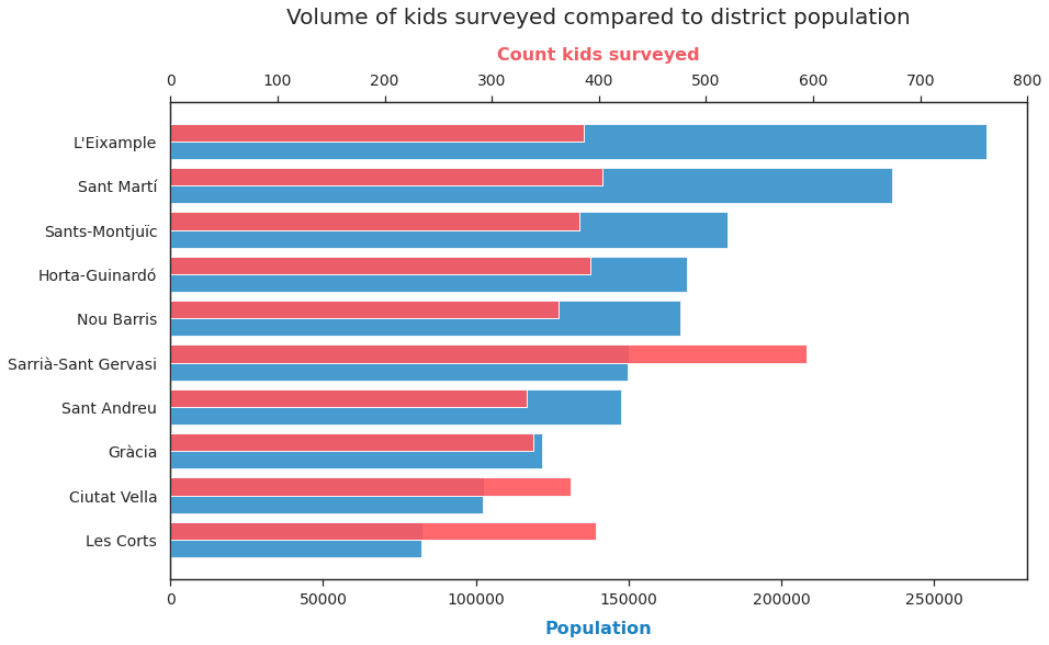
Now let's look at the districts of the kids surveyed and let's evaluate its distribution against the actual population from Barcelona:

Here, it's seen that the proportions of kids surveyed do not follow Barcelona's Population distribution. Rather, the most and least populated neighbourhoods have the same amount of answers and means that the survey results will not precisely represent Barcelona distribution. However, the amount of data points by district allows us to make conclusions about the districts separately.
Nevertheless, Sarrà-Sant Gervasi has a representation of 600 kids while the rest of the neighbourhoods range between 350-400 kids. This is an important difference since Sarrà-Sant Gervasi is a known expensive neighbourhood, which will be overrepresented on the aggregated results.
When evaluating the different levels of income of the districts an incongruence was detected in the survey on variable 'ERFDbllp',
which represents the different income levels (Low, Intermediate and High).
It was possible to see that different income levels were associated with the same district, thus it was not possible to identify a unique income level by district.
To analyse this situation, it was necessary to include the information from the actual RFD index of the district in the same year. This information was gathered from the beforementioned Territorial dataset from BCN OpenData.
Two examples are used to display the incongruences:

The stacked bars highlights how different income levels are appointed to each district.
At an early stage, the expectation was that each district would have one defined income level.
However, it was possible to observe that the differences came from the aggregation of neighbourhoods to districts.
In the Survey data, we don't have the neighbourhoods where the kids are from, only their district.
But in variable 'ERFDbllp' the information is provided at neighbourhood level.
Observing the two examples provided, it is possible to see the diversity within districts and recognize that there is not always a predominant level above the others.
In Ciutat Vella 60% of the kids surveyed are from a low-income neighbourhood and up to 35% from an intermediate-income level.
A different situation is encountered in Les Corts, where almost 40% of the kids are from a neighbourhood marked outside of Barcelona.
This highlights a potential error in the data set: That neighbourhoods are stated as being outside of Barcelona.
Les Corts falls on the border of Barcelona municipality, limiting at its west, north-west and south with three different municipalities.
Therefore, it could be that one neighbourhood was incorrectly labelled as outside of Barcelona or
that one neighbourhood from another municipality was included in the study.
Regardless of the situation, the data from Les Corts will still be used since the objective is not to accurately represent the children
only from the Barcelona municipality, but to get an overview of the children's welfare in the area.
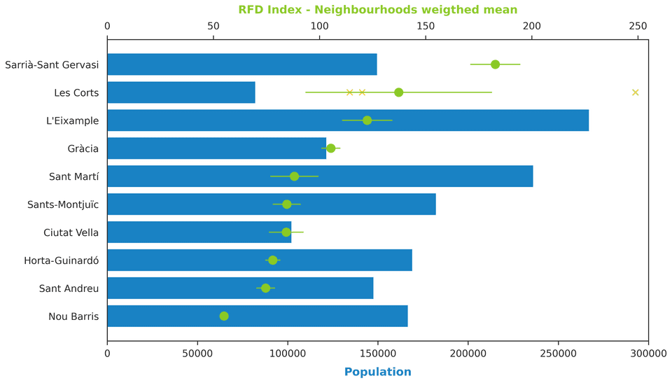
Using the economical data from the districts, it is possible to find the RFD index("Renta Familiar Disponible", translated to "Available Family Income") for each district, to get an overview of which districts are more wealthy than others. A plot has been created, where the bottom axis shows the population count, while the top axis shows the RFD index weighted mean, together with its standard error.

It is possible to observe that there are some districts wealthier than others. With Sarrià-Sant Gervasi, Les Corts and L'Eixample being the wealthiest and Nou Barris, Sant Andreu and Horta-Guinardó the least wealthy.
However, it is important to discuss on the high standard error of Les Corts. The district only includes 3 neighbourhoods (a low number compared to the other districts, as dispalyed in section: Territorial Distribution ), and the neighbourhoods are very diverse. In fact, the RFD index of each neighbourhood was included in the plot (with yellow crosses) to highlight their differences. The neighbourhood with the highest index corresponds to Pedralbes, which is the known most expensive area in Barcelona city, being the dwelling of the Consulate of the United States of America and residence of billionaires. This neighbourhood is far from any other, including La Maternitat and Les Corts (barri) the two other neighbourhood from the district.
About the Districts
Before going through the kids' perception of welfare it is interesting to evaluate the characteristics of the districts they live in.
First, the kids' perception on two valuable elements of their district are evaluated: Its security and its areas dedicated for children. In the survey, kids were asked how much they agreed on sentences: "I feel secure when walking through my neighbourhood" and "In the neighbourhood I live, there are enough areas where I can play". Their agreement was classified in different levels, however, to understand the behaviour by district we will focus on the proportion of kids that agreed with the statements.
Perception of district security
Perception of district playground areas
Ratio of “Agreement”
In the plot presented, a lower ratio will indicate that there is a lower number of kids feeling secure or feeling that they have enough areas to play. The two plots are displayed together to compare if there is a shared pattern between the two elements.
It is possible to observe that the distribution is more diverse when it comes to security, compared to the playgrounds. Sants-Montjuïc, Ciutat Vella and Nou Barris are the districts with the lowest agreement on security. As previously commented, Nou Barris is the district with the lowest RFD index, however the other two fall in the intermediate-low range. Sants-Montjuïc and Ciutat Vella appear as well as the districts where kids don't agree on having enough areas to play, together with Horta-Guinardó. This highlights a potential relationship between the two elements, however correlation doesn't imply causality, and there could be an unexplored confounder such as, for example, the monetary investments the district received.
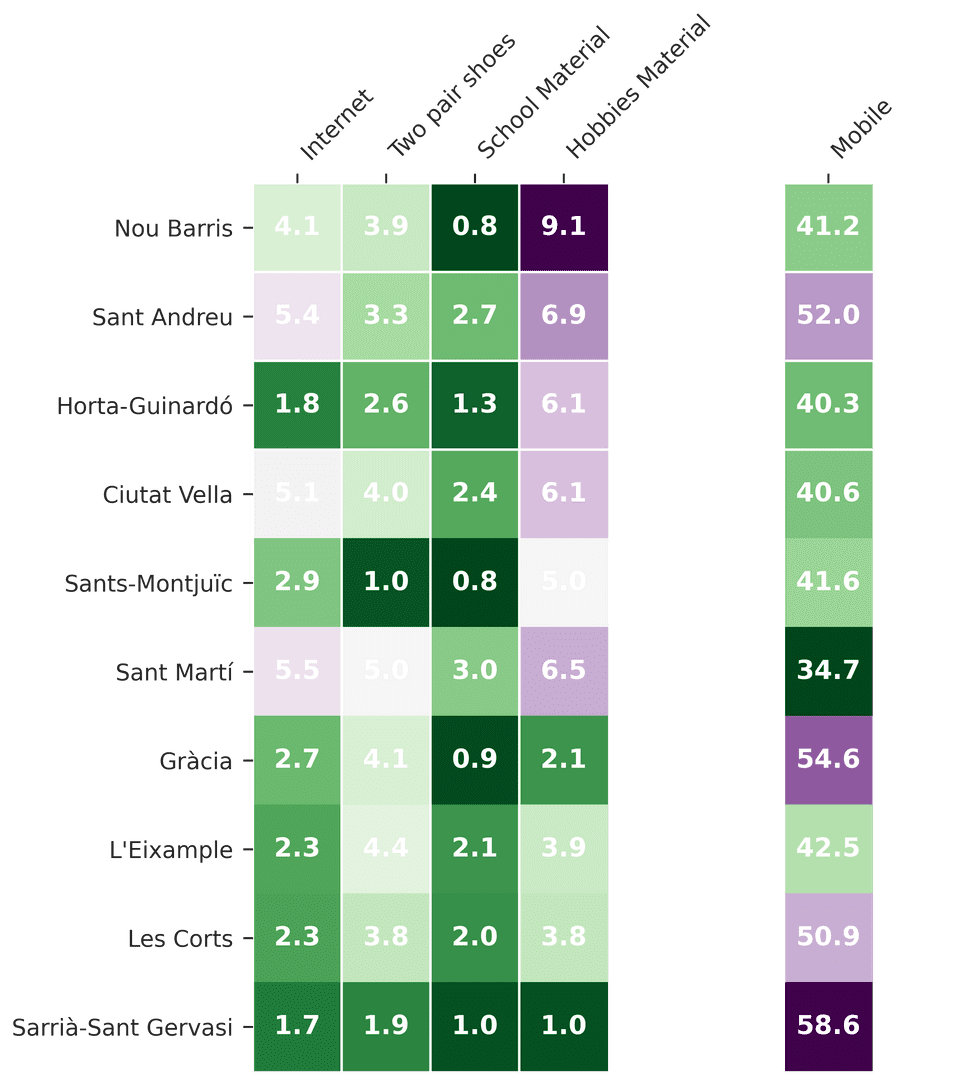
Secondly, it is interesting to assess the material scarcities that the children might be experiencing. To evaluate them, a set of Yes-No questions were evaluated and the proportion of No's are displayed:
Ratio of “No” access to materials

The districts are ordered by descending RFD index, from Nou Barris to Sarrià-Sant Gervasi. This ordering allows seeing how the greener colours fall in the bottom left of the table, showing that the wealthier have indeed more access to basic materials. It is interesting to evaluate the differences between categories. The proportion of kids that don't have enough school materials is lower than in other categories, indicating that most kids have access to them. However, the disparity is stronger when it comes to the materials to do their hobbies and having a study place to study at home. With the most disadvantaged neighbourhoods having the highest ratio of deficiencies. It is interesting as well to see the heavy differences between having or not a mobile phone. The higher ratio of kids that don't have a mobile phone is in the wealthier districts. Inverting the pattern previously observed on the other materials. Therefore, the proportion of kids in wealthier districts that have mobile phone is lower.
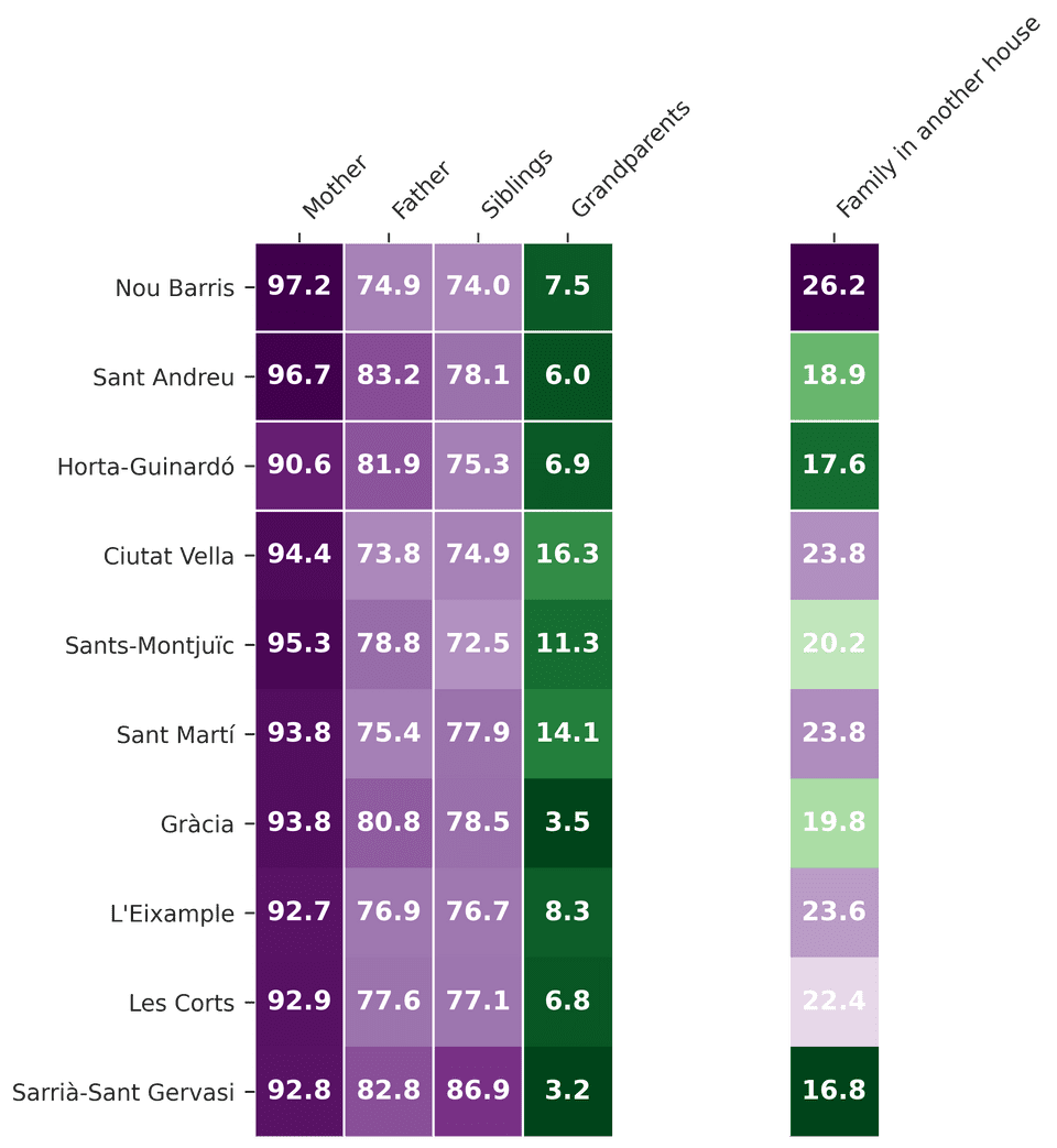
Another important aspect is to evaluate if there are differences in the family structure. To analyse it, the results of the question "Who lives with you in the house where you live all the time or the majority of the time?"
Ratio of “Yes” on people who live in the household

The results show that in all districts there is a higher proportion of kids living with their mothers than with their fathers, the range is surprisingly different. Furthermore, it is possible to see that the proportion of kids living with their mothers is higher for the most disadvantaged districts. Looking at the ratios of Family on another house, it is possible to observe that the ratio doesn't strictly follow the wealthiness order, but still, the highest proportion is identified on Nou Barris while the lowest in Sarrià-Sant Gervasi.
About Feelings
To explore the frequency of different emotions the survey includes one question where kids are asked to identify how often they have felt different emotions during the last two weeks. The kids need to select one level from 0 to 10, where 0 represents that you have Not felt this emotion in the last two weeks and 10 that you have felt it All the time.
The next plot displays the ratio of the different frequency levels per pair of opposite feelings. To get a view of the complete distribution of one feeling, for example to observe the tail of Happiness, it is possible to select the different feelings on the legend (by clicking on them). Furthermore, it is possible to explore the differences between districts by filtering in the top panel, providing details on demand.
It is possible to appreciate the importance of extreme answers. The higher proportion of answers falls in extreme values, All the time - 10 for the positive feelings and Never - 0 on the negative feelings. This tendency to select the extreme answers can be related to the fact that we are analyzing kids between ages 10 to 12. These are ages where the characterized sensibility of adults, is not yet completely developed 1. When looking at surveys from teenagers and adults it is possible to see a change in the behaviour 2. This phenomenon is described as Vital Optimism-Bias (Casas, 2011; Casas i Bello, 2012) and explains how kids tend to answer more positively than adults when asked about their welfare.
The peak is higher in the positive feelings than in the negative ones, around 50% of marked that they felt Happy and Energetic, "All the time". Only 2% of kids marked a level of 4 or less in Happiness, nonetheless, even if the ratio is low it should not be overlooked since this represents that approximately 80 of the kids surveyed are rarely feeling happy. The peak for the rest of the feelings falls within the 20% - 30% range, with Calm reassembling more the behaviour of the negative feelings (with a mirrored distribution). It is as well possible to see a peak on the answers at level 5, which falls in the middle of the distribution. This behaviour is not strange, since could reflect the more hesitant kids.
When evaluating the negative feelings it is possible to see that the tail of the distribution is wider. This represents that even if kids will generally say that they experience Happiness "All the time", 14% of them will experience Sadness "Usually", marking it with a level of 7 or above. The same is observed with Stress and Boredom, which reaches a proportion of 30% and 22% respectively, in the same frequency level.
When comparing the districts, the pattern of mosts feelings is maintained but slight differences are detected on Boredom. To assess theese differences in detail, it is necessary to visualize all districts together:
Ratio of answers for high frequency levels (7 or above)
While the behaviour for the positive feelings is maintained for the different districts, there are some clear deviations on the negative feelings.
If we take the district with the highest RFD Index, Sarrià-Sant Gervasi and compare it with the lowest one, Nou Barris. It is possible to detect an increase of 8 points in Boredom and 4 points in Sadness, for Nou Barris. These suggest a difference in behaviour between income levels.
However, this pattern is not always maintained. When comparing the districts in the lower range of RFD Index (Nou Barris, Horta-Guinardó and Sant Andreu) it is possible to observe that the behaviour of Horta-Guinardó is similar to Nou Barris but the level of stress is 5 points higher. Instead the behaviour of Sant Andreu reassembles more the behaviour detected for Sarrià-Sant Gervasi. Therefore, even if we can detect differences between the different neighbourhoods, it is important to look into other variables that might be affecting the emotions of the children.
Exploring Life Satisfaction
Instead of looking at the feelings, it is as well possible to evaluate the children's perception towards life satisfaction. The survey includes the question: "To what extent are you satisfied with your life? Where kids can answer by marking a level between 0 to 10, with 0 being "Not at all" and 10 "Completely Satisfied".
To evaluate the children answers the factors have been aggregated in 4 levels: "Very", "Fairly", "Slightly" and "Not at all". When an answer is not provided it is considered as "NC".
To evaluate how different plots impact the life satisfaction, it is possible to plot it against different variables.
To what extent are you satisfied with your life?
Let's start by looking at the different districts: Sant Andreu and Ciutat Vella are the two districts with the lowest ratio of kids "very" Satisfied with their life.
It is interesting to observe that they also were the two districts with the highest ratio of boredom.
This might indicate a relation between life satisfaction and the boredom experienced.
Furthermore, Sarrià-Sant Gervasi is the district with the highest ratio of kids "very" satisfied, indicating the beforementioned connection with income.
To investigate the relation with the income, we can evaluate the results for the neighbourhood's income levels in variable 'ERFDbllp'.
Even if these levels would represent different categories in each district, evaluating them can help clarify the relation with the income:
The plot shows a decrease of the "very statisfied ratio" with the decrease of income. However, it is important to keep in mind that the number of neighbourhoods classified as high-income have a lower representation.
To finalize the assesment of the income it is possible to examine the results of the question "How often are you concerned about the money your family has?". Here, the same pattern is observed: The kids with a higher concern on money show the lowest ratio on life satisfaction. Looking at the distribution of the answer counts, it is possible to notice a tendency to mark "Sometimes" and "Never" over other levels.
However, it is interesting to observe how other variables behave as well:
It is possible to observe that there is not a significant difference between genders. However, when looking at the age, there is a slight decrease with growth. This could refer back to the before-mentioned "vital optimism-bias" and how, with the transition towards adolescence, the optimism starts to decrease.
It is interesting as well, to asses additional attributes, such as if there is a difference for kids that have learning difficulties. In the survey the kids are asked to answer yes or no to the question: "Do you have a learning difficulty such as: dyslexia, attention deficit disorder, hyperactivity or others?"
It is possible to observe that the satisfaction level is lower for the kids that have learning difficulties, almost 20% of them marked as "Fairly" satisfied and 10% "Slightly". However is important to keep in mind, that the proportion of kids that answer "Yes" or "Not sure" represents only a 12% of the answers.
K-Means Clustering
So far several different attributes have been manually explored to see their impact on life satisfaction. But we were curious to see if the data would have any underlying clustering, that wouldn't be possible for humans to see, but maybe a machine learning model would be able to catch.
To explore that option, a K-means clustering model was created. The data was split into two categories, using the SLSSmc column.
The value in this column represented if the participants were: "Very satisfied", "Fairly satisfied", "Slightly satisfied", or "Not at all".
Here, one category would represent participants who were "very satisfied" and all other options would be categorized as "other",
in an effort to make the two clusters equal in size.
The data used in the model was a combination of all attributes investigated during the satisfaction analysis,
including columns as Sexe (Gender), Edat (Age), ERFDbllp (Type of neighbourhood), etc.
Additional columns were also added in an effort to include as much information as possible in the analysis.
Relevant columns were binarized or one-hot-encoded.
A K-Means model with two clusters was initialized using SKLearn. The data was then fitted to the model and labels from the clusters were generated. Because K-Means model knows nothing about the identity of the clusters the labels returned might be permuted, thus it was necessary to match each learned cluster label with its true labels.
The K-Means clustering model accurately clusters our data, with an accuracy of . Looking at this number alone, makes it look like some kind of clustering is apparent, but it could be misleading. The two categories created, had the following number of observations:
Then, with a quick calculation we observe:
Therefore, the accuracy achieved could, in reality, be the result of clustering all data points as a single cluster or, if two clusters are present, both clusters consists of a majority of the "very satisfied" category.
Final Discussion
This report was divided into three sections that aimed to unravel the effects that the demographic characteristics of a district may have on the children of Barcelona.
The first step aimed to understand how the children perceive these characteristics over their own neighbourhood. Initially, their perception of security was studied, and it was possible to understand in which neighbourhoods the children felt less secure. However, it was interesting to compare it with their perception over a more positive element, being the availability of playgrounds. Certain similarities were identified. The neighbourhoods with lower income being the ones perceived as less secure and with fewer playgrounds. However, this behaviour was not maintained in all instances. It was as well interesting to analyse the differences between districts on the accessibility to materials and their family typologies.
Having learned a bit more about the districts, it was interesting to evaluate the feelings of children. The vital optimism bias was appreciated since over 50% of kids responded that they felt always Happy and Energetic over the past two weeks. However, when looking at the differences between districts it was not directly clear how the behaviours changed. By performing a radar plot it was possible to aggregate all information together and identify that there were indeed differences when it came to negative feelings. Different ratios were identified for Boredom and Stress over the districts, but it was difficult to identify a clear pattern.
Lastly, in order to define one measure that could be compared against different attributes, "life satisfaction" was evaluated. It was possible to detect clearer distinctions on satisfaction levels when evaluating different income-related attributes. However, other variables were as well contributing, as it was possible to see with kids having learning difficulties or even their age. These effects made us wonder if a machine learning algorithm could help us identify how the different variables, we had available, contributed to the children satisfaction. A K-Means clustering was performed but the results obtained were not completely satisfying. Nevertheless, our feeling is that other algorithms might be able to provide better results. Thus our next steps would be to perform more trials and continue our investigation towards, which characteristics contribute to the kids' life satisfaction. When we can answer the question, we would be able to identify which corrective actions could boost children's welfare.